- Why ScienceLogic
- Main Menu
- Why ScienceLogic
Why ScienceLogic
See why our AI Platform fuels innovation for top-tier organizations.
- Why ScienceLogic
- Customer Enablement
- Trust Center
- Service Partners
- Technology Partners
- Pricing
- Contact Us
- Product Tours
 See ScienceLogic in actionTake a Tour
Experience the platform and use cases first-hand.
- Platform
- Main Menu
- Platform
ScienceLogic AI Platform
Observe. Advise. Automate.
- Skylar One
- Skylar One Studio
- Skylar Automation
- Skylar Compliance
- Skylar AI
- Skylar Analytics
- Skylar Advisor
- Integrations
- Platform Overview
- Test Drive
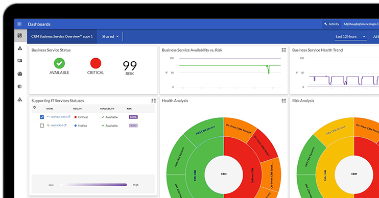 Take Skylar One for a SpinStart Your Test Drive
Feel the power of AI-Driven Observability with a 14-day test drive.
- Solutions
- Main Menu
- Solutions
Solutions
From automating workflows to reducing MTTR, there's a solution for your use case.
- By Industry
- By Use Case
- By Initiative
- Explore All Solutions
- Analyst Report
 The Gartner® Magic Quadrant™ for Observability PlatformsRead the Report
See why ScienceLogic was named a Visionary.
- Learn
- Main Menu
- Learn
Learn
Catalyze and automate essential operations throughout the organization with these insights.
- Blog
- Community
- Resources
- Events
- Podcasts
- Platform Tours
- Free Trial
- Customer Success Stories
- Training & Certification
- Explore All Resources
- Analyst Report
 The Forrester Wave™: AIOps Platforms, Q2 2025Access the Report
See why ScienceLogic has been named a Leader, with the highest score in the Strategy category.
- Company
- Main Menu
- Company
Company
We’re on a mission to make your IT team’s lives easier and your customers happier.
- About Us
- Careers
- Newsroom
- Leadership
- Contact Us
- Live Webinar
 Cut the Noise. Prove the Value. Skylar Advisor.Save Your Seat
See how Skylar Advisor turns telemetry and documentation into prioritized, evidence-backed actions.
April 15, 2026
Blog
August 11, 2021
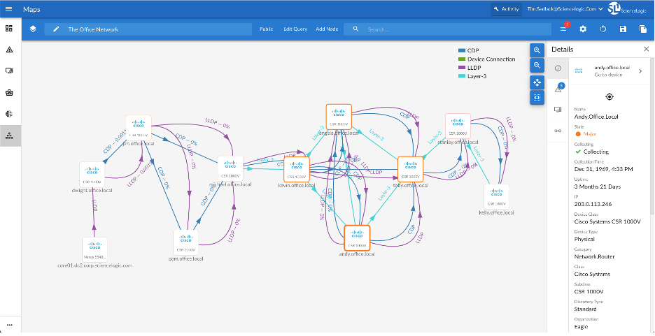
The Importance of Visualizing Your IT Environment
AIOps,
Monitoring

